Lost in the System
An inverse audit of time served in Florida's prisons
Abstract
Most machine learning aimed at carceral data points at people -- risk scores and recidivism predictions that justify holding someone longer. This project points the other way. Rather than scoring individuals, it audits the system's own retention decisions, asking, of the people Florida is still holding, whose time served has run far past what comparable cases actually received.
Training quantile-regression models on Florida's released cohort -- who the state let go, and after how long -- then applying them to the people still inside, 3,893 of 65,108 people screened (5.98%) have already served beyond the 99th percentile of time served for comparable cases. Race is never a model input, yet Black people are flagged at 1.34 times the rate of White people.
Where the flagged cases come from depends entirely on what you measure, and the three measures cohere only when read together. Raw volume tracks the urban population centers, but both the racial disparity and the per-capita rate concentrate in rural north Florida -- the same small counties carry the burden twice over, while the cities carry only the count.
This is not a verdict on anyone, and it is certainly not a sentencing recommendation -- a model cannot say what a sentence should be. It is a prioritized, checkable starting point for the advocates and attorneys whose review capacity is finite: thousands of people the state's own records show held far past their peers, with a clear racial and geographic skew, each case ready for a human second look.
Introduction
In Florida's prisons there is a population of long-serving people who remain incarcerated decades past the point where comparable people were released. Many entered custody during the punitive sentencing era of the 1970s through early 1990s, often on medium-severity offenses, and -- through the cumulative effects of parole abolition, lost contacts, and institutional attrition -- have been, in every practical sense, forgotten by the world. I know that population from the inside: I spent nineteen years in Florida custody, and I watched people serve far past anything that resembled their peers' sentences.
No existing mechanism reliably surfaces these cases, and that is the heart of the problem. Clemency in Florida requires the petitioner to know to apply and to mount a credible case -- and commutation is essentially never granted. Post-conviction legal advocacy depends on the person already being known to an attorney or an organization. The state's periodic re-sentencing initiatives are narrowly scoped to specific statutory categories -- juvenile lifers, isolated drug cohorts -- and never reach this group. The audit gap is one of design, not bandwidth: this population is invisible to every existing process. Nobody is assigned to ask whether a person is simply still here for no reason the data can explain.
This project is a deliberate inversion of the usual way machine learning meets carceral data. Recidivism prediction and risk scoring use ML to extend or justify state action against individuals. This turns the scrutiny the other way -- against the state's retention of individuals, and specifically those whose continued incarceration diverges sharply from the pattern visible in comparable releases. The model does not recommend sentences, score risk, or guide any carceral decision. Its only output is a ranked list of cases for human review.
Like everything I publish, it is an open investigation: the method is fully documented, the line between what I release and what I withhold is explicit, and both are open to inspection.
Where the Data Comes From
- FDOC OBIS Database — the Offender Based Information System is Florida's internal record of all prisoner data, released as a bulk public-records download. It is raw and messy: dates in two-digit years, inconsistent charge descriptions, free-text fields. Every extraction and cleaning step is in the methods repository.
- U.S. Census — county boundaries (cartographic boundary files) and county population (Population Estimates) are used only for the geographic figures. Public reference data, no individual records.
Each released and active record is verifiable, one at a time, against FDOC's own public inmate locator. For full detail on how the data is extracted, transformed, and modeled, see the methods repository.
How the Audit Works
The released cohort -- everyone let go, and how long they served -- is the evidence of what Florida actually does. I fit three models to it that predict not a single expected time served but a distribution: the median, the 95th percentile, and the 99th percentile of time served given a case's features. Applied to a person still inside, the 99th-percentile line answers a specific question: has this person already served longer than 99% of the released people whose cases looked like theirs? If yes, the case is flagged.
Because a model can be a black box, every flag is paired with a second, transparent check: the 100 nearest released peers, matched within the same sentencing era and sex. Their actual outcomes -- real historical time served -- are the comparator. A reviewer does not have to trust the model; they can look at the peers and check them against the public record themselves.
What the Records Show
The two cohorts already tell different stories. The released cohort clusters short -- a median of 16 months, most people home within a few years. The active cohort carries a far heavier tail: a median of 23 months, but a long upper reach of people who have been inside for decades and are still inside.
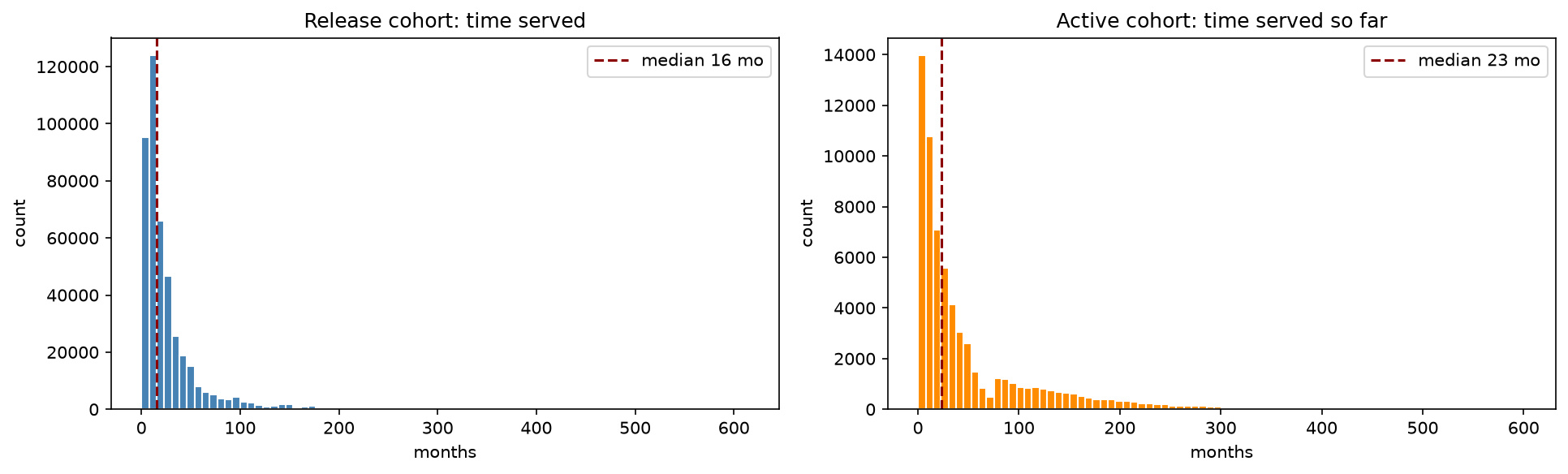
That difference is not a quirk of the data -- it is expected, and it is the whole reason this audit can work. Two structural facts produce it. First, the released cohort is a flow: everyone who has passed through and out, dominated by the huge volume of short-sentence cases that cycle quickly. The active cohort is a stock: a single snapshot of who is inside right now, and a snapshot inevitably accumulates long-servers, because the longer a sentence runs the more snapshots it appears in. A cross-section of a prison over-represents long sentences for the same reason a photograph of a highway over-represents slow cars. Second, the active figures are time served so far -- right-censored, a floor rather than a final total, because these people are still inside. So the active distribution's rightward shift and heavier tail are exactly what the structure predicts, before any injustice enters the picture.
That expected gap is the signal, not noise to be corrected away. The released flow encodes how the system typically processes a given kind of case; the active stock is where the long-servers pile up. So the method trains on the flow and then asks, of each person in the stock, whether they have already served longer than nearly everyone released with a comparable profile -- while their clock is still running. A person who passes the 99th percentile of completed, comparable sentences before their own sentence is even over is precisely the forgotten long-server this project set out to find.
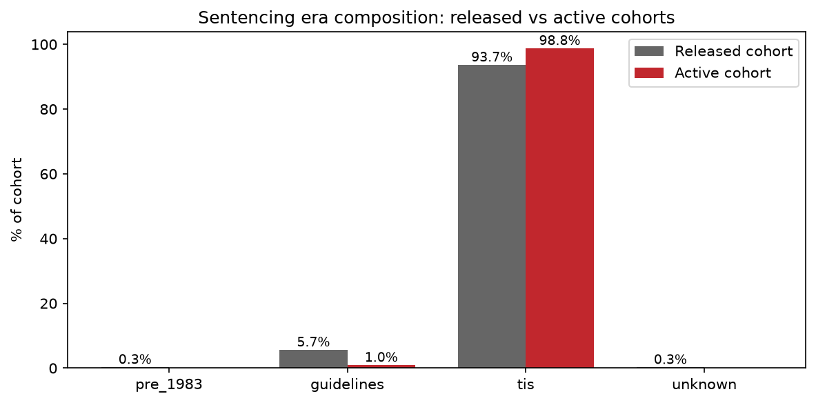
Almost everyone now inside was sentenced under Truth-in-Sentencing, the 1995 regime that abolished parole and requires 85% of a sentence be served. The released cohort still contains a meaningful slice of people sentenced under the older guidelines and pre-1983 regimes; the active cohort is 98.8% Truth-in-Sentencing. The handful of people still held under the abolished regimes are, almost by definition, the longest-serving.
What a Single Flagged Case Looks Like
Before the aggregate, the unit. Every flagged person produces one of these: the individual plotted against the actual time served by their 100 matched peers, with the strip beneath showing the ten nearest -- their years served and how close a match each is. There are roughly 3,900 of them, one plot per flagged person, and each is a self-contained, checkable argument an advocate can take straight to the public record. The one below is synthetic -- a constructed illustration that corresponds to no real individual. The real per-case figures carry living people's record numbers and are never published; they exist only for the advocates reviewing specific cases.
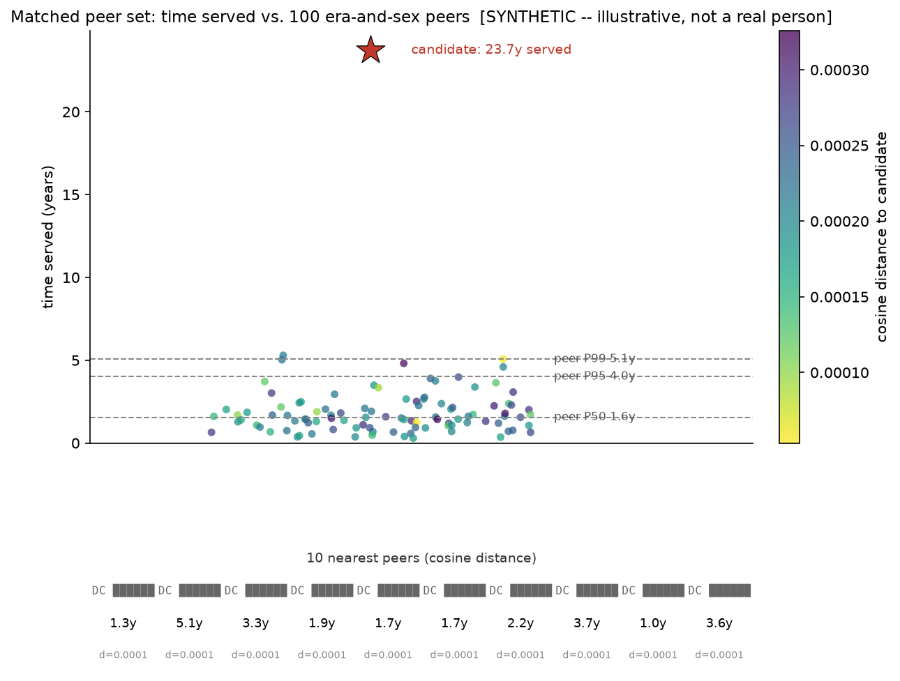
The rest of this audit asks who the other ~3,900 are -- and whether the state's retention falls evenly across the people it holds.
Aggregate Findings from Real-data Candidate Pool
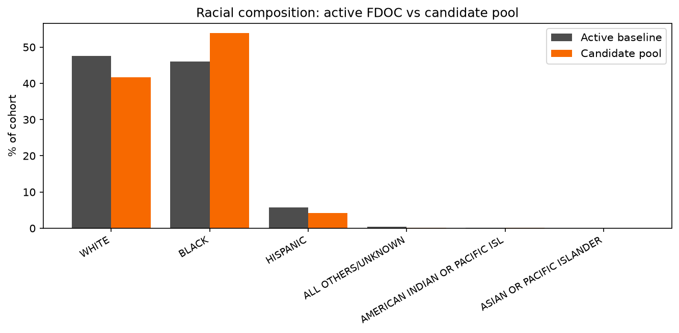
The model never sees race. Race is rejoined only after the flags are assigned -- so any racial pattern in the flagged pool is a property of the system's retention, not of the model's inputs. The pattern is there. Black people make up 46% of the active population but 54% of the flagged pool. The flag rate is 7.0% for Black people and 5.2% for White people: a 1.34x disparity in who has been held past the 99th percentile of their peers.
Geography, Three Ways
Where the flagged cases come from depends entirely on what you measure -- and the three measures tell a coherent story only when read together.
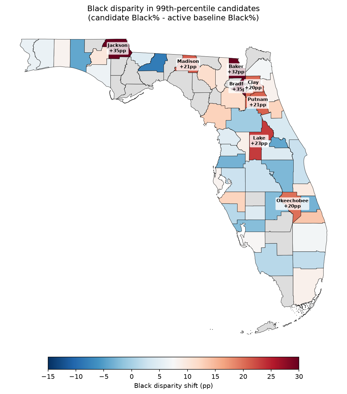
The racial disparity concentrates in the rural panhandle and north-central counties -- Jackson, Bradford, Baker, Lake and the band around them -- not in the urban prosecutorial centers where Florida sentencing disparity is usually framed.
It is hard to miss what several of those counties also share. Jackson County holds two of the state's most documented histories of racial violence: the 1934 lynching of Claude Neal, and the Dozier School for Boys in Marianna -- the state reform school where boys were abused for a century and buried by the dozens in unmarked graves, three times as many of the dead Black as white, many of them committed for nothing graver than running away. Lake County is where Sheriff Willis McCall shot two of the Groveland Four while they were in his custody in 1951. Baker County held Black laborers in turpentine debt-peonage well into the twentieth century. The audit makes no causal claim -- it does not argue that this history produces today's retention. It only observes that the disparity lands in the same counties whose records of racial violence are the best documented in the state.
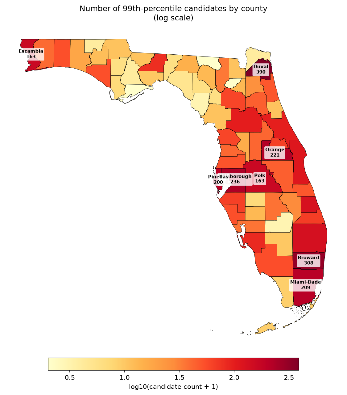
Raw volume tells the opposite-looking story, because volume just tracks where the people are. The large urban counties contribute the most flagged cases simply because they hold the most people: Duval, Broward, Hillsborough, Orange, Miami-Dade.
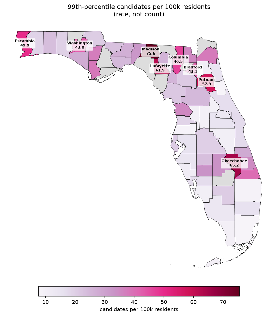
But counts only tell you where the flagged people are, not where this weighs most heavily. Normalize to candidates per 100,000 residents and the cities fall away while the smallest rural counties rise to the top -- Madison at 75.6, Okeechobee at 65.2, Lafayette at 61.9, Putnam at 57.9 -- some of the least-populated counties in the state carrying its heaviest per-resident share of people held past their peers. They are the same small, rural places that anchor the racial disparity, and rural Florida bears it twice over: in who is flagged, and in how hard it lands per person. The three maps are one finding from three angles -- the cities hold the volume, but the disparity and the rate both settle into the rural counties the volume map all but erases.
What This Does, and Does Not, License
A descriptive distribution of what the system did is not a normative anchor for what a sentence should be. To read these flags as "the right amount of time" would be a category error -- it would launder decades of disparate sentencing into a baseline and call it fair. The 99th-percentile line is a tripwire for human review, nothing more. Whether any flagged person should be released is a legal and moral question for people, not a model.
Three commitments hold the work to that line. No individual is ever published -- the flagged list and the per-case peer sets stay private, shared only with advocates reviewing specific cases. The trained model is never released, because it is invertible and could be misused to rationalize retention rather than question it. And the method is published in full, on the principle that accountability work earns trust by being inspectable, not by being hidden. The full method and governance boundary are public.